Tuesday, 30 September 2014
My target audience presentation
This is my powerpoint presentation representing information about my music magazines target audience. I used slideshare.net to add this presentation onto my blog, I created an account, uploaded my presentation, then I clicked on the HTML button on a blog post and then pasted the code. This websitewas quick and easy to use.
Music magazine drawn drafts (cover, contents and double page spread)
 |
| Cover |

This is my brief contents page draft, I intend to add an image of my self with my hair flowing in the air in order to create the effect that I am at a dance club jumping up and down to the music. I am going to use a bold green font for the contents header, and for the letter 'O' I am going to replace it with an image of a record because this fits in perfectly with the dance style music. I am them going to add feature on the bottom right hand side of the page to advertise new headphones. The background colour will be black and there will be four texts boxes in a lighter grey shade behind the text, so it can be seen clearly by the audience.

Three masthead designs

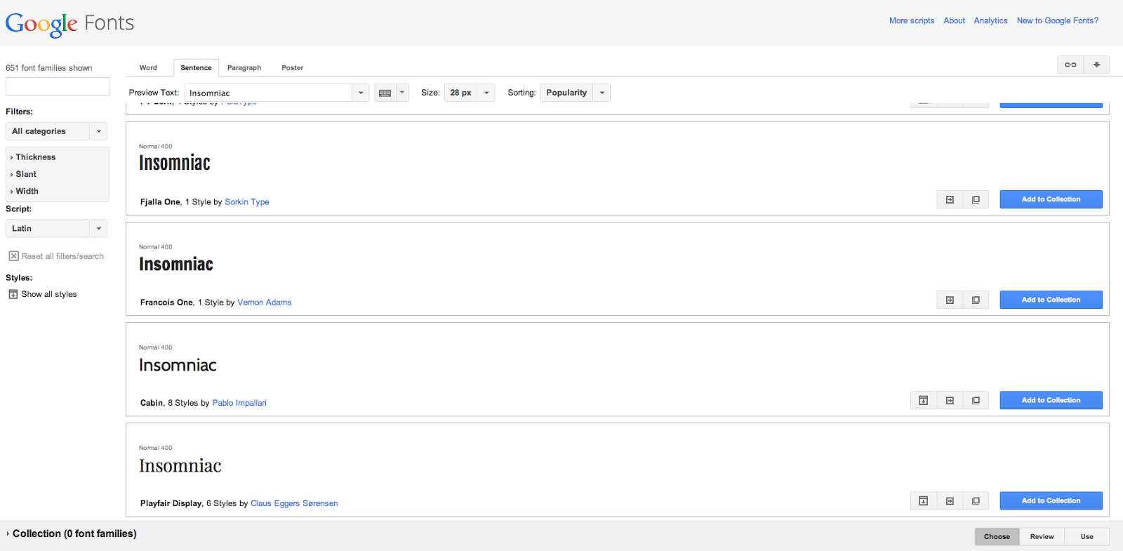

The images above represent some of the fonts that I thought looked professional and and effective. I used dafont.com then googlefonts.com and then 1001fonts.com. All three of these websites were incredibly easy to use and the images above show my favourite fonts off each of the websightes. I used the screen munch technique on my mobile phone in order to add the following images. I used the words Euphoria, Insomniac and Pulse when testing the variety of fonts off each of the websites. These are the three possible names that I may entitle my music magazines masthead. I asked three members of my family and two friends what font they thought looked the most effective and all said the fonts of Dafont looked the most effective.
Music magazine cover analysis (Rolling stone)

One of the denotations such as the feature article photo of the female on the cover indicates to me that this magazine is aimed at most men due to the fact that she is wearing a very revealing outfit that would appeal to most people who are attracted to women and it would cause them to look at the magazine in a voyeristic fashion however it could also be aimed at a female audience because the woman on the cover may be a role model to them due to her body image or talent or they may also find her attractive. The way the women is positioned in the image is quite sexual because her face is serious and her arms are raised, this shows me thats she is posing, this attracts people to buy the magazine and represents her as voyeristic due to her serious attitude. The feature article photo and background image is in black and white however some of the text is in red this emphasizes certain aspects of the magazine such as the mast head and the kicker and the word, icon in the cover line is underlined in red, this appeals to the reader and automatically draws their attention to read the interesting topics therefor they know what the issue is about, this may motivate people to buy the magazine if they are interested in its recent topics.The artists name on the head line is in a large bold font compared to the rest of the text so it stands out the most therefore the audience is aware of the main artist mentioned in the magazine. The names of the other artists are in a medium font so they also stand out to the audience. The genre of the magazine is female artists pop music because all of the artists mentioned on the cover are female, I also think it represents females careers in the singing business. The mast head, rolling stones is a connotation of the magazines genre, being about music due to the fact that the title is a well know bands name. I think that the way the magazine has used a black and white background and red text on interesting topics is a very intelligent and effective idea for the magazine cover therefor I think it is successful.
Music magazine cover analysis (Classic Fm magazine)

This magazine appears to me that it is aimed at the audience of the older generation due to the fact that most of the younger generation are more interested in current pop music instead of classical. The artist in the centre on the feature article photo is also a older musician who younger people may not have heard of because of the fact that he probably made most of his music before the current young people were born. The feature article photo is a mid shot and the colour scheme used on the cover is very mature in my opinion for example, the magazine is not pink and purple which is stereotypically a young girls magazines or a women's gossip magazine. The mast head is a connotation of the genre of the magazine as it is entitled classic fm and the genre of the magazine is classical. Also the head line explains that the artist on the feature article photo has brought out a new classical cd which also represents that the magazine is classical. The Baton in the artists hand is used by conductors of classical music to direct an group musicians this also represents that the magazine is about classical music. A denotation such as the cover line mentioning that CDs are rated, appeals to audiences who want to look at rates. Different font sizes have been used in order to make the magazine look more effective and interesting to read. The menu strip motivates people to buy the magazine because it says it includes a free cd and 50 free classical downloads. The letter, 'f' in the mast head is also in a different font to the rest if the text and is in a red colour this makes the mast head look more interesting. This magazine is overall very subtle and mature for the older audience its aimed at therefor in my opinion it is an extremely effective magazine cover.
Music magazine cover analysis (Top of the pops magazine)

This magazine automatically appeals to the younger generation, especially young girls in my opinion due to the fact that the magazine includes a lot of bold pink colours which is stereotypically a feminine colour. Denotations such as shopping items and young boys also adds to the fact that the magazine is most likely to be targeted at younger girls. The mast head, top of the pops is a connotation of the magazines genre which is, pop. I also think that the mast heads font looks slightly cartoon style which appeals to young people. The word, body in the head line is in a large font compared to the rest of the text and is centered on the cover, this automatically makes the audience look at that text and read it. There are many features on the cover that motivate the target audience to buy the magazine such as a kicker that mentions a story about a young girl, the header about Astons story, a cover line that mentions how to steal a stars look and a selling line that mentions romantic romeos, all of these features are succesfull ways of reaching the target audience in order to persuade them to purchase the magazine because these features make the magazine sound intersting. The meaning of the magazine is to show what fashions are in at the moment and to show stories about the latest pop stars. The magazine is in a gossip genre in my opinion because of all the stories about others and its also a pop genre because it its about popstars. Looking at the magazine cover it represents recent pop for the younger generation because the artists being represented in the magazine are recent pop stars. Due to the feature article photo being in the center of the magazine cover I think this makes the magazine look professional and catches the audiences attention due to the size of the image and how it overlapps the text. The feauture article photo is a mid shot I think this looks effective. All of the artists featured on the magazine cover seem to have a possitive attitude because they are smiling this creates a happy atmosphere on the cover, all of artists featured are all also fully clothed, to avoid voyerism being represented. The cover line is in a large font, I think that this is to make it stand out on the magazine so that the reader reads that information because it is an exciting topic in the magazine, motivating people to buy it. In my opinion I think that this magazine cover is very effective in appealing its younger audience because I believe it is a extremelly succesfull design overall.
Music collage

This is my 'mood board' that I created for my planning process for my music magazine cover. I created this mood board/collage, to show the different types of artists that represent the certain genre of music that my music magazine is going to based on. My music magazine is going to be in the genre of, Dance and will hopefully have a slightly retro atmosphere about it. I chose to pick the dance theme because I personally enjoy dance music and the whole stlye of dance lovers and artists. I have many creative ideas such as, photography ideas and names for my music magazine. I used an application on my I pad, entitled pic collage to create this image, I found it very easy to use and think it is a very succesful way of combining a variety of different sized images in order for them to all be viewed equally.
Shot type research
Today I found out some information about shot types. Below I am going to state a variety of different shot types and put next to them examples of what angles each of the shots may achieve.
Eye level- Makes two characters look like they are having a conversation or confrontation, or they are in love, etcetera, depending on the context of the drama.
Worms eye- Makes something look bigger (giving a character a sense of power and making them appear more dominant in comparison to others).
High angle- Makes someone look dominant in contrast to someone else.
Canted- A character may be on the floor for example, they have collapsed.
Low angle- Makes a character look less dominant, for example, they are looking up to someone
Birds eye- To establish the scenes surroundings.
I also researched the word cinematography and found out that it means camera movement. These are the different camera movements:
Crab- e.g. walking whilst filming but no moving the camera.
Track-e.g. following someone/ something whilst filming.
Pan- e.g. moving the camera from one thing to another (panning).
Zoom- e.g. In and out from a long shot to a close up.
Tilt- e.g. Tiliting movement of the camera.
crane- e.g. The camera goes up (looking down on something or people).
Zoom- e.g. In and out from a long shot to a close up.
Tilt- e.g. Tiliting movement of the camera.
crane- e.g. The camera goes up (looking down on something or people).
My weekly plan week seven
By the end of this week I hope to have completed the following blog posts:
- Shot type research information
- Collage/ Mood board of what genre of music magazine I intend to create. (Images of artists of a certain music genre for example Jake Bug and The Arctic Monkey would come under the category of indie music).
- Music magazine cover analysis for Top of the pops magazine
- Music magazine cover analysis for Classic Fm magazine
- Music magazine cover analysis for Rolling stone magazine
- Three music masthead ideas and audience research
- Music magazine drawn drafts (cover, contents page, double page spread)
- A presentation on my music magazine target audience
My contents page step four

Finally I created another new layer and added another text box, explaining again what was on each page. I like how all of the text was to the left and the figure was on the right hand side of the page, I thought this made the page look effective however I do not think that the contents page looks very professional overall and therefor next time I create another contents page I will choose a different font.
My contents page step three

After creating another new layer and adding a new text box, I then started to write what was on each page, I used a smaller font compared to the title but used the same shade of red as I did on the title. I again placed the text to the left hand side because the text stood out more in the brighter ares of the background in comparison to the darker areas.
My contents page step two

I then created a new layer and inserted the text, contents. I decided to chose the red colour because I thought it would stand out in contrast to the black and white background. I used the font rockwell because I think it is easy to read and looks effective. I also chose to have the text to the left hand side of the page because it is white in that area and the red stood out more on white rather on the black and grey areas.
My contents page step one

This is my mid shot image of my friend Mat for my contents page that I took on my phone, I edited this midshot to a black and white colour using my effects available on my phone, I then uploaded the image to the computer via email and created a new page on a photoshop document, then I used a dragging motion to place my image on the page.
Monday, 29 September 2014
My friends brief analysis of my college magazine cover

I decided to ask a friend for their views on my college magazine as she is a student at college therefor she is the suitable target audience for the magazine. I used I message to contact her and I took her criticism into consideration for when I create another magazine cover in the future.
Sunday, 28 September 2014
My weekly plan week six
This time next week I will hopefully have completed the following tasks below:
An image of my completed college magazine
My friends brief analysis of my college magazine cover (using, I message on my phone)
An analysis of my college magazine
Step one progress of my contents page for my college magazine
Step two progress of my contents page for my college magazine
Step three progress of my contents page for my college magazine
Step four progress of my contents page for my college magazine
Lets do this...
College magazine evaluation

This is my complete magazine cover, looking at my finished magazine cover I am not happy with my colour scheme that I used. I think the magazine would have looked better in a bold red colour because I feel that it would make the magazine appear more appealing to my target audience which is college students. However I am extremely happy with my mastheads font because i think that it looks professional and I think that the layout of my cover line, header, kicker and headline, are successful because I thought that they were interesting to look at as all of the text was not straight and the diagonal effect makes the magazine cover look more interesting. I also like how the rectangles emphazise the white writing so it stands out to readers. If I could improve my magazine cover I would drag my headline lower because I think it would look more neat and easier to read and I would also add different coloured text so the page looked more colourful and bold.

Saturday, 27 September 2014
My college magazine step eleven

Finally i then added text over my rectangle to complete my menu strip and then my magazine was completely finished. I really enjoyed the process of making this magazine cover.
My college magazine step ten

I the added the text, A level results over the top of the third rectangle and I then decided to create a long rectangle for my magazines menu strip.
My college magazine step nine

My college magazine step eight

I added a question above the revision tips text because I thought that it look effective there. I also positioned another rectangle as a base for more text. In my opinion the contrast between the white text and the green rectangles creates a bold effect.
My college magazine step seven

I the added the text, revision tips and put the font colour in white to contrast the text with the green rectangle behind it. I thought this graphic feature would make the magazine look stylish and modern for the younger audience that it is appealing to.
Friday, 26 September 2014
My weekly plan week five
Now that I have reached my fifth week on my AS media course I have decided to give my self a larger target this is to add seven new blog posts this week, these posts will be:
Step seven progress of my college magazine
Step eight progress of my college magazine
Step nine progress of my college magazine
Step ten process of my college magazine
Step eleven process of my college magazine
Drafts of my college magazine (my drawings)
Add photos that I have taken on my phone that were for my college magazine, (even if I did not use them in my final design).
That is my overall target, I had better get to work!
Thursday, 25 September 2014
My college magazine step six

I then added a rectangle by using the rectangle tool on the left hand side of the screen, I made the rectangle a slighty darker green colour in comparison to the text because I wanted it to stand out. I used the free transform tool to rotate it slightly.
My college magazine step five

I then created two new layers layers, one for the student gossip text and the other for the discount text. I decided that I was unsatisfied with my headline, kicker and header all being straight therefor I decided to rotate the texts slightly by using the free transform tool. I thought this made the cover look more appealing to the audience.
My college magazine step four

After creating a new layer I added the text, quiz overload, I typed this text in capital letters due to the fact that it is the head line and I wanted it to stand out to the audience. I used the font Rockwell. I thought it was the most suitable font for a college magazine.
Wednesday, 24 September 2014
My college magazine step three

I created a new layer and dragged an image of a barcode onto the left hand side of the screen. I included a barcode to make my magazine cover appear more professional. I then added a new layer and used the text tool and typed in the price of the magazine, I used a slightly lighter shade of green on the price than I did on the mast head by using the colour tool on the top right hand side of the photoshop tool bar.
Friday, 19 September 2014
My weekly plan week four
This week I intent to add my, third, fourth, fifth and sixth steps of my progress on my college magazine each with an analysis of what I have done for each step individually.
Thursday, 18 September 2014
My college magazine step two
Secondly I added a mast head by creating a new layer and inserting the text that I desired. I decided to entitle my magazine cover, education because I thought it was an effective name for a college magazine. I also chose a merky green font because I thought that it looked mature for students and it didnt look to immature or unprofessional. I used a font that is easy for the audience to read. I thought that the curves in the letters would make the mast head stand out, make it easy to read and most importantly catch the readers attention.
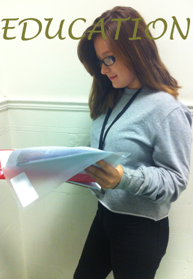
My college magazine step one

I took this mid shot image of my friend on my phone, I then emailed the picture to myself and saved it onto the computer. I then dragged the the image onto a photoshop document on a new page. I instructed her to position herself sideways because I thought it looked more professional and effective rather than her just similing to the camera, I also thought that an action shot of her reading would be more suitable for a college magazine.
Costumes and props/ reasons for choice

For my college magazine cover I used the props that are presented on the image above. I instructed my friend to wear a lanyard and to hold a file and to read it. I thought this would make the image look effective and it fits in with college life for example, revising. I didnt use any costume in particular I just took a picture of her in the clothes she was wearing that day, which were casual, so they fit in well with student style.

I thought that when the props were used and the way she was positioned made the shot look like a action shot that suited a college magazine perfectly.
College magazine progress to date
On my next blog posts I will be showing each step of how I am creating my college magazine so that the process is clear to see. I will be carrying this process idea out on separate blog posts for each step that I apply in order to create the magazine. I think that this will be an organised way of helping me know where I am up to whilst making the magazine.
College magazine photos


All of these images are the pictures that I took for my college magazine, I used my phone to take the following images and I decided to use the effects on my phone to change some of the images for example, I used a black and white effect on one image and I used the enhance effect on some of the images to make them appear as high quality images in order for them to look professional. I decided to use two of these pictures, one for my magazine cover and one for my contents page.
College magazine drafts


These two images are my brief illustrations of how I wanted my college magazine to appear. I chose to use the top image due to the fact that I thought the mid shot would look more effective and professional. Although I thought that the second image looked successful I preferred the mast head name of the first image because I thought that the name, college for a college magazine was to obvious and predictable.
Wednesday, 17 September 2014
Font activity

Although there are a variety of fonts on photoshop, I found a website that has a wider variety of fonts. This website is entitled Da font and I screen muched some of the different fonts that I thought would look good on my magazine cover and put them into a collage. I only used the word, college as an example. I think that I may used the font Ariq Sya from Da font because I think that it would look the most professional and appealing on a magazine cover.
Saturday, 13 September 2014
My weekly plan week three
This week I am planning to add a masthead practice, this is were I intend to use the website, 'Da font' which includes a variety of different fonts, where I am going to add onto a collage, my favourite fonts on that website that I may use on my college magazine. Then I am going to add a picture onto my blog of what costumes and props I intend to use and the reasons for my choice. I am then going to add my first two steps of what I have done on my progress of my college magazine.
Friday, 12 September 2014
Audience interview videos (college)

This video contains feedback for my survey about what my college magazine should include in order for it to be effective and appealing. I asked a series of questions to five of my peers. This process helped me to develop ideas and to produce my magazine. I asked the following questions,
What do you enjoy about college life?
What main features would attract you to read the college magazine?
How would you feel about the magazine including give away contests?
Would you desire for the magazine to include support for your revision and homework?
Would you be interested in the magazine including information about extra curricular activities that take place at Hyde Clarendon?
The variety of different answers such as to add college gossip, give aways and contests helped me to create ideas to use on my cover. To create the video I used an app on my phone entitled, Video FX live, I thought it was very useful to link all of the different interviews together onto one video.
Wednesday, 10 September 2014
Audience interview questions (college)
The series of questions below are what I have asked some college students regarding my music magazine:
1) What do you enjoy about college life?
2) What main features would attract you to read the college magazine?
3) How would you feel about the magazine including giveaway contests?
4) Would you desire for the magazine to include support for your revision and homework?
5) Would you be interested in the magazine including information about extra curricular activities that take place at Hyde Clarendon College?
I am going to ask these questions whilst videoing the students.
Medium close up examples


Tuesday, 9 September 2014
College magazine analysis

This magazine is in the genre of college life, obviously the denotation such as the mast head represents that the magazine is about college because it is entitled, college. The word freshman is also used in the headline so this also shows that the genre of the magazine is about college. Their is a student on the mid shot feature article photo, she is smiling therefor she is represented as an innocent young student who has a postive attitude. The feature article photo is overlaps the mast head making it stand out. The head line mentions the girls fashion, and there is a outfit behind her on the image, this shows her work and due to her smile she looks proud. She is fully clothed, so the magazine cover is not voyeristic. The target audience of the magazine is aimed at students due to the fact that the genre of the magazine is about college however it could also be aimed at the students parents if they are interested in reading about their childs college news. I can also tell that this magazine is aimed at students because the colours used on the cover appear mature, for example a magazine aimed at young girls would most be in bold pink or purple colours, whereas this magazine cover uses red and black colours which are more mature in my opinion. The header, head line and cover line are all in capital letters to make the main topics stand out to the audience. The mast head and the word, greek on the selling line are in a red font whereas the rest of the text is in black this makes these to words stand out in comparison with the rest of the text. The barcode is placed on the left hand side of the cover so it doesnt effect the display of feature article photo. The magazine appeals to students because the issues on the magazine are based on topics that are likely to interest young people for example, tattoos and a story about a freshman, this motivates students to buy the magazine because they may be interested on the issues on the cover. Overall I think that this magazine is effective.
Sunday, 7 September 2014
Indesign tutorial

Saturday, 6 September 2014
My weekly plan week two
During my second week I intent to carry out four tasks successfully and to publish them onto my blog. The first task I need to complete is an, Indesign film review tutorial. This is where I will be following instructions on how to move an image and text onto an article using the indesign software. Secondly I want to add an analysis of a college magazine cover that i will find on google images. I will also be researching medium close up shots therefor I am going to add some examples of medium close up shots onto my blog. Lastly I will be filming my interviews with my fellow college students and ask them various questions regarding what they would be interested in, in a college magazine, I will also be using an app called video FX Live which successfully merges videos together so I wouldn't have to make lots of different videos for each interview.
Friday, 5 September 2014
Photoshop Challenge

I completed a photoshop challenge by following a sheet full of tasks, the image above was my outcome. Firstly I opened up an A4 document to work on, then added text and changed it to the font, Century Gothic, I then changed the colour to red and changed the font size to 24 and centred it into the top of the page and changed to the background colour to a blue tone as instructed. Secondly I gave the text a drop shadow by highlighting it. I was then given the challenge to insert a picture of a person off the internet and place it under the text and change their hair colour. I choose Audrey Hepburn as she inspires me and is my ultimate role model. So I found my favourite image of her and dragged it onto photoshop straight from google images. I then used the magic want tool and then the paint bucket tool to turn her hair into a lime green colour in certain places of her hair. Overall I found this task very difficult due to the fact that it was my second time on photoshop and I am still getting used to the software however I finished all of the tasks successfully and I now feel more confident on where to find certain tools to edit images more effectively.
Thursday, 4 September 2014
Skin tutorial

Photoshop CD Tutorial
Wednesday, 3 September 2014
My weekly plan week one
During my first week of my media course I am going to develop my skills on photoshop by getting to know the tools. At the moment I feel really unconfident with the software and the apple mac computer that I am using, therefor I intend to practice using the programme and computer in order to understand how to use them correctly. Hopefully I will have more knowledge of the new technology I am using by next week.
Tuesday, 2 September 2014
Welcome message
Hello and a hearty welcome my name is Mia Alexandra Jones and I am currently studying AS media at Hyde Clarendon college, this blog will display all of my work during my course. I hope you enjoy my journey!xo
Subscribe to:
Comments (Atom)