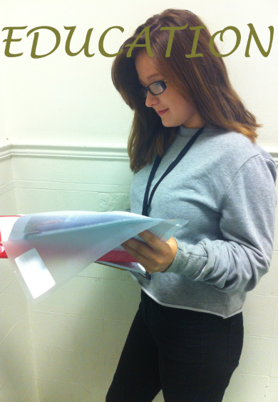
Secondly I added a mast head by creating a new layer and inserting the text that I desired. I decided to entitle my magazine cover, education because I thought it was an effective name for a college magazine. I also chose a merky green font because I thought that it looked mature for students and it didnt look to immature or unprofessional. I used a font that is easy for the audience to read. I thought that the curves in the letters would make the mast head stand out, make it easy to read and most importantly catch the readers attention.

No comments:
Post a Comment